Design for American Museum of Natural History (Client)
Interactive 3D Ology Cards

Overview
Background & Problem
The American Museum of Natural History plays a key role in educating young children globally, and its affiliated children’s website, Ology, is an important part of that mission. The Ology Card section, which offers a wealth of knowledge, data, and quizzes through digital cards, however, remains underutilized.
Our evaluation indicates that the format of the Ology website's static, digital-only cards might limit young learners' engagement. These cards haven't engaged most museum visitors and elementary school students. Despite their rich content, they lack interactivity and fun elements, resulting in low usage rates and poor visibility.


Solution & Outcome
Interactive 3D Ology Cards is an integrated solution for enhancing educational experiences for K-12 children by incorporating physical, AR, and 3D web Ology cards into the museum's affiliated children's site, Ology. The goal is to achieve a playful and effective learning experience while giving the Ology website more exposure.
The project was well received and highly rated by the clients, helping the team build long-term connections with the clients.
My Role
Team Mates
Timeline
Project Lead
UIUX Iterations
Web Development
Ming Li (AR developer)
Ruiyan Sun (UIUX Design)
2023.10-2023.12
Tools
UIUX: Figma, FigJam
AR and Animation: Blender, Orinix
Web: three.js, javaScript, Replit
Product Demonstration
Physical Card

Scan
AR
Interactive 3D Card

Button Click
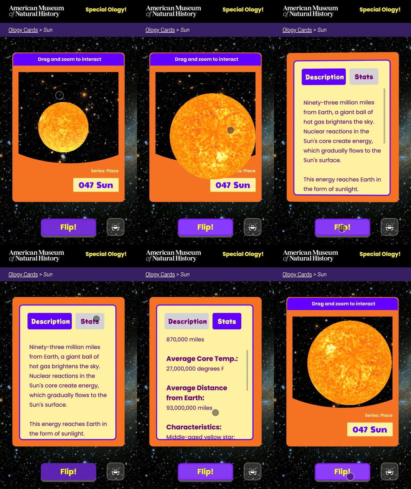
Button Click

Physical Copy of Card: Sun

Physical Copy of Card: Blue Whale

Physical Copy of Card: Tornado


AR View

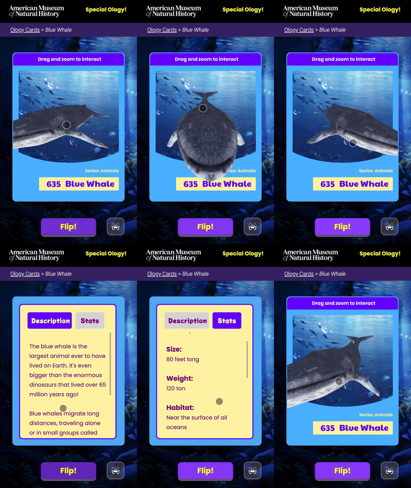
AR View

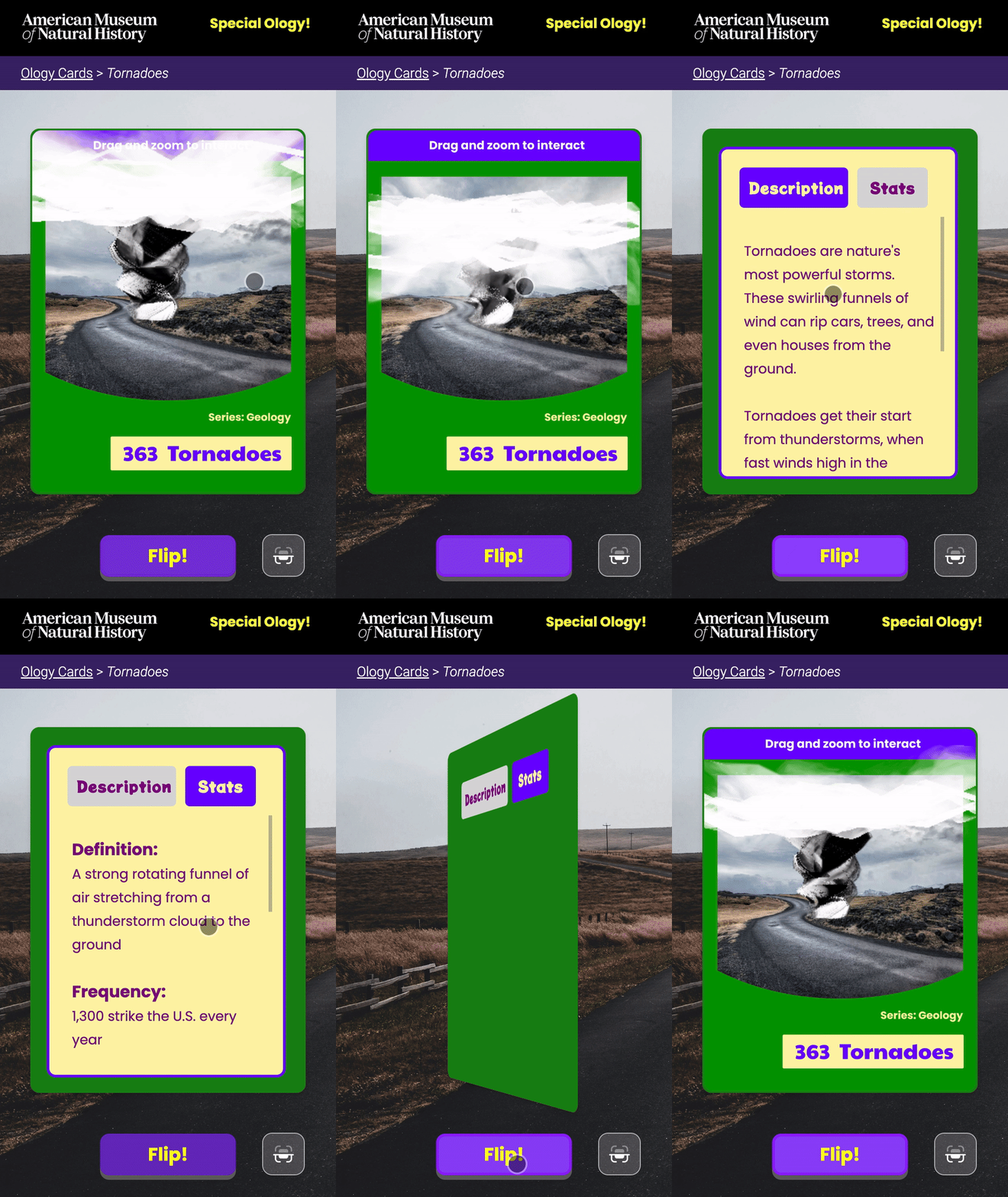
AR View
Research, Ideation and Proof of Concept
Start from Interactive 3D
The cartoon style and static images on the cards provide valuable opportunities for exploration. As designers, we aim to enable young individuals to perceive an object's true form dynamically rather than as a flat representation. We are enthusiastic about the potential to transform 2D cards into interactive 3D experiences, with Augmented Reality enhancing engagement for younger audiences.
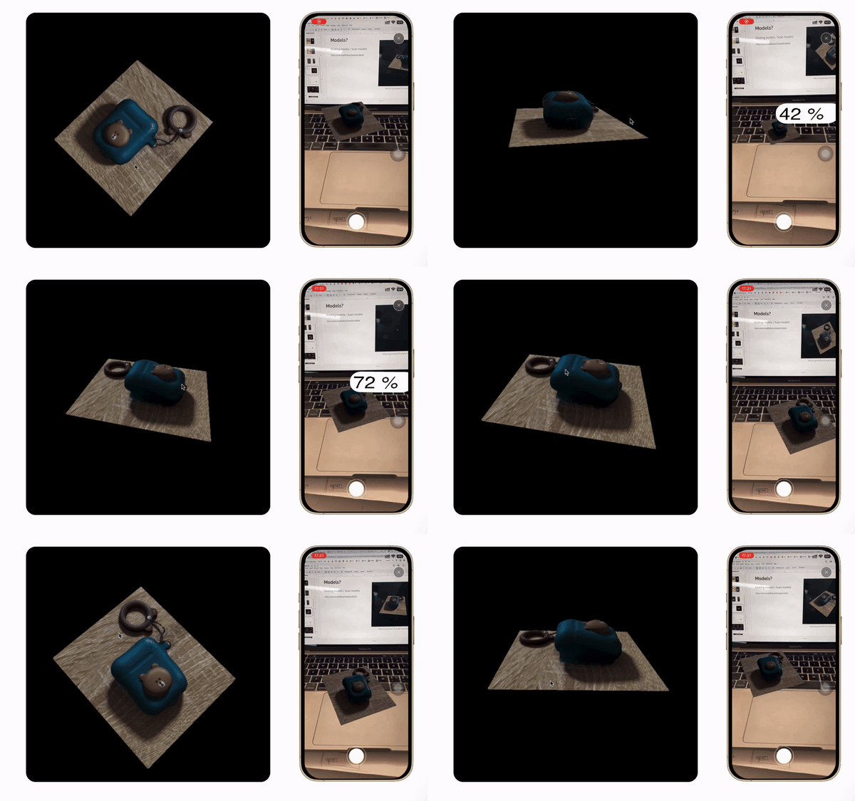
To evaluate the feasibility, I demonstrated my 3D-scanned AirPods as a model in both web and AR environments for PoC during the pitch.
Integrating Physical Cards
The museum store is one of the most frequented areas within the museum. During our research visit, we noted the lack of Ology derivatives or card derivatives. We proposed that establishing a connection between the physical Ology collective cards and AR as well as website cards could effectively expand the learning scenario for kids, for example, in class, and enhance the website's visibility for both educational and marketing purposes. Our client acknowledged the merit of our suggestion and expressed support for the integration of physical, AR, and web cards following our presentation.

Example Use scenario: In Class
Product Logistic
We were excited by concept and proof of concept, and we explored a cyclical flow that combines physical, AR, and web cards, as shown in the chat on the right.
As we delved into the use case and application of our, we developed a solution for attracting traffic and increasing exposure for the Museum and Ology through the integration of and digital cards. (Refer to the chart below)

Two-way User Flow Logistic

Design Iterations
Iteration 1
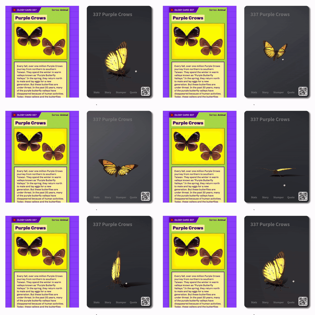
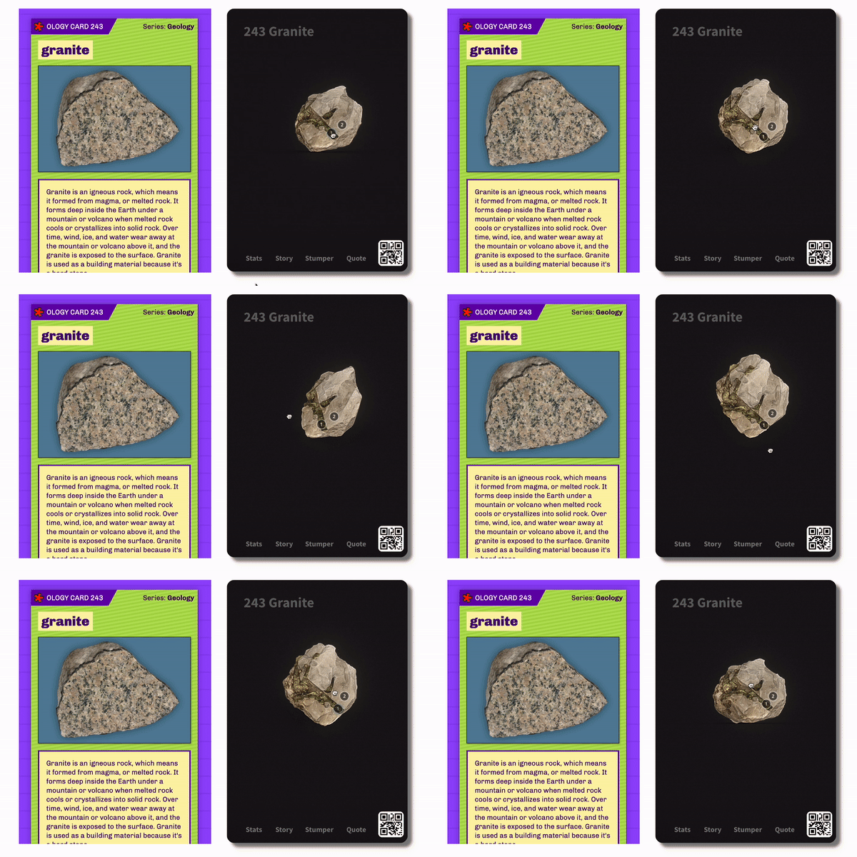

Device Selection
We chose a mobile device for its scanning features and compatibility with physical cards.
Concept and Format
We designed a "premiere" style for our unique 3D interactive cards. Additionally, we developed a low-fidelity sketch of a card folder concept to enhance user engagement.
Card Content
Inspired by the original Ology Cards, we kept the Ology card number, title, and a concise one-sentence description on the front. To ensure consistency, we also incorporated the Stats information on the back design of the cards.
Positive
Engagement
3D interactive effects are impressive and engaging.
Real Models Work
The real 3D models are good for educating new objects to young children.
Need to Improve
Design for Kids
The design of Premiere cards is more adult-friendly and hard to attract young children.
Simplify the interaction
The card folder idea is great but young people don't have the intention to drag back and forth. Keep it simple for kids.
Feedback from clients
Iteration 2
Device Switch and Simplified Interaction Method
As we researched and observed Kid's interactions with Ology, we found that instead of using mobile, they prefer using iPad as the tool according to their use scenario - at home or in any learning environment. We switched our interface to the iPad. We also removed the card folder and the swiping interaction - to keep it simple for kids.
Object Reselection
As one of the feedback from clients, Ology cards should include objects that are not only tangible but also intangible. Instead of randomly choosing objects, we decided to make three sample cards, Blue Whale (a creature), Tornado ( a natural phenomenon), and Sun (an object), to ensure the diversity of the card content.
Physical Card Design Iterations
We did several iterations on the interface design, especially on physical cards. We included 3D elements using the "out of frame" illusion on the card as well as instructions on how to use the card on the back.


Positive
Card Information Design
It's nice that we have clear information on the card including Ology info, QR code for AR, and instructions on the back.
Out-of-frame Illution Design
This strategy makes a lot of sense when it refers to 3D cards.
Need to Improve
Accessibility and Contrast
The color choices don't have enough contrast. This discourages people from reading but also is not appealing to young childre.
Keep the Ology design consistent
The design should include more elements that visually belong to Ology.
Feedback from clients
Iteration 3: Design for Kids
Color Redesign
I finalized the color and card interface for physical and digital cards. I tested and used bold colors with contrast considered. The UI consists of Ology elements that keep the style consistent with the Ology itself.
Interaction More considered
Through user tests, we found that a highlighted "Flip" button would be intuitive for kids to click on. I also added instructions on interacting with color on the top of the digital cards and the back of the physical cards. The goal is to ensure the cards are user-friendly and fun to interact with.


Final Outcome of Card Design

Thoughts and Takeaway
Understanding the Audience
Reflecting on our journey, we dedicated significantly to product logic and iterating the for children. While we understood we were for kids, we didn't fully grasp how different it was from mainstream design visuals and interactions. This experience has taught me the importance of considering the audience and user behavior patterns in product logistics, allowing me to save time and enhance efficiency.
Embracing the Role of a Design Technologist
I truly enjoy the dual role of designer and engineer in this project. Particularly in 3D design, crucial elements that impact user experience—like light selection, model choice, camera distance, and orbit angles—can be efficiently adjusted during the design process. I find great satisfaction in seeing the design come to life through my own efforts.
Pitch and Present at AMNH


Project Exhibition in Brooklyn in Spring 2024


